Design Process
I understand how it can be a little unnerving to hire a designer. It’s sort of like asking someone you don’t know to pick out the clothes you’re going to wear for the next several years. Be brave!
When I work with you I’m going to ask you lots of questions. Every project here started with lots of questions. Because the tools of my trade are not, as many would tell you, images and colors and fonts. The tools of my trade are questions.
I like to work with people who have ideas, people who participate in and enjoy the creative act. So. Be prepared for lots of questions. After I ask them, then I’ll translate your answers into images and colors and fonts.
Here are a few examples of the design process.

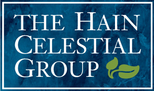
THE HAIN CELESTIAL GROUP
Identity Design / Branding Studies
When Celestial Seasonings merged with Hain Foods, they asked me to do studies for the new branding. They said maybe they wanted some reference to natural foods without picturing a particular food type. Wheat might be OK, though, as a symbol of daily bread.
Or maybe not. (That happens sometimes.) Maybe it should be just type. And maybe there should be a nod to the encircling C in the Celestial logo.

Final logo.

EMERSIV
Identity Design / Branding Studies
I worked with a Boston firm doing studies for Emersiv, a company that did telemarketing technology.
I start every project with a design brief. It’s derived from interviews with the client and usually it’s a list of criteria and adjectives. For this project the brief included:
friendly
thorough
tech
distinct
readable
blue*
*OK, sometimes the client just wants blue. Now, usually the client shouldn’t be the one deciding colors. (That would be my job and I’m a better designer than you.) But if you want blue, I’ll probably show you blue. If there’s a good sound reason it shouldn’t be blue, I’ll tell you it shouldn’t be blue.

PLACE
Identity Design / Branding Studies
I did this series of branding studies for Place, a residential real estate developer, whose tagline was, “Building for People.” How do you symbolize “place” in a friendly, appealing way that maintains a sense of human scale?