Case Studies

CELESTIAL SEASONINGS
Identity Design / Branding
Before and After
The logo redesign was part of a broader effort to improve the “billboarding” of the brand, giving Celestial greater visual impact on retail shelves.
After twenty years using the new branding they’ve updated the packaging a couple of times. I like the updates.

CHOCOLOVE
Identity Design / Branding / Packaging
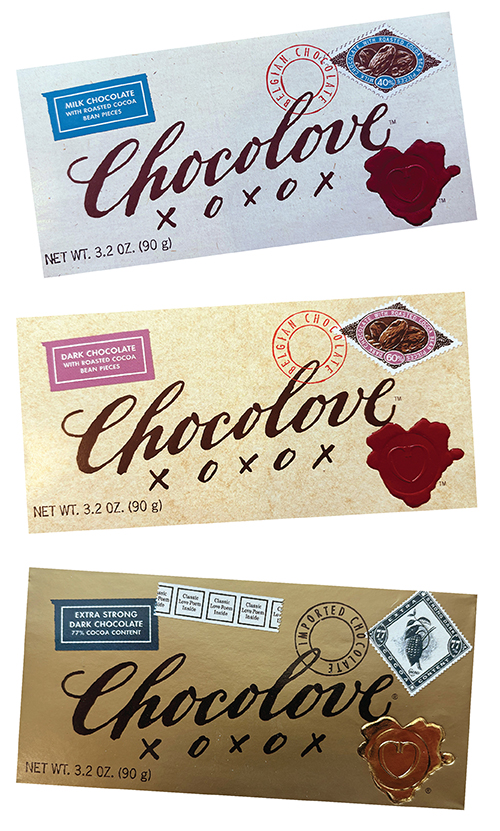
In 1995, Timothy Moley came to me with an idea and some very good chocolate. Timothy wanted to build a premium chocolate brand. He says he can taste chocolate the way a sommelier tastes wine.
We talked a lot about chocolate – how it raises the level of theobromines in your brain, the same as falling in love. We talked about how chocolate has always been associated with love. (Hershey doesn’t call them kisses for nothin’.) The branding was born out of these talks. The packaging became a love letter and the name became a signature on the love letter, complete with XOXOX.
Timothy’s idea paid off. Today, Chocolove, based in Boulder, Colorado, does an estimated $7.4 million in business yearly. And customers love the branding with the type of chocolate illustrated by a stamp on the corner of the package and always with a love poem inside.
Chocolove is a premium example of how Curio Design can delve into the goals and desires of an entrepreneur and create an identity that expresses those goals for decades.
MUSEUM OF CONTEMPORARY ART | DENVER
Identity Design / Branding
Before and After
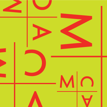
When the visionary curator, Cydney Payton, took the reins at Museum of Contemporary Art | Denver, she knew she needed to build strong branding for the institution. And she had to do it fast. We started with a simple monogram and an attitude. The logo varies (the color changes, the letters rotate) as do all the design materials, according to the look of the current show. The goal is to keep the image always fresh, always contemporary and always looking like it came from MCA | Denver.
To see more design for the museum, click here.

D’AIQ ARCHITECTS
Identity Design / Branding
Before and After
Bruno D’Agostino, Charles Izzo and Tommy Quirk are Cambridge architects. They wisely go by the name D’AIQ.
In the 80’s I helped the architects establish a strong monogram identity. It’s still in use today.
SCT
Identity Design / Branding
Before and After
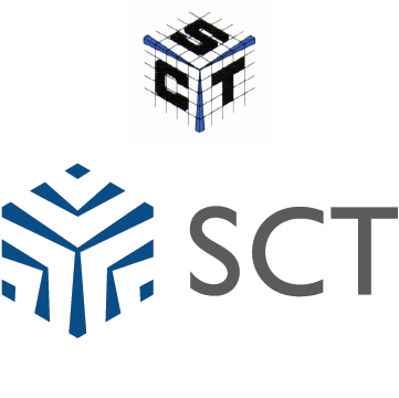
SCT produces super-cooled super conducting technology used in cellular phone towers. An engineer drew the original logo based on the hexagonal area covered by each tower. They wanted to maintain the logo’s equity but make it simpler and easier to reproduce. They liked the result and took to calling it the “snowflake.”

ARIZONA CENTER
Design / Branding
Arizona Center is a mixed-use retail development in downtown Phoenix. The charge was to do branding that looked like the future of Arizona. Nothing they’d seen before. Not a whisper of Southwest decor. No turquoise. The logo’s symbol grew out of the plan of the extensive gardens that surround the shopping center.