MUSEUM OF CONTEMPORARY ART | DENVER
Identity Design / Branding
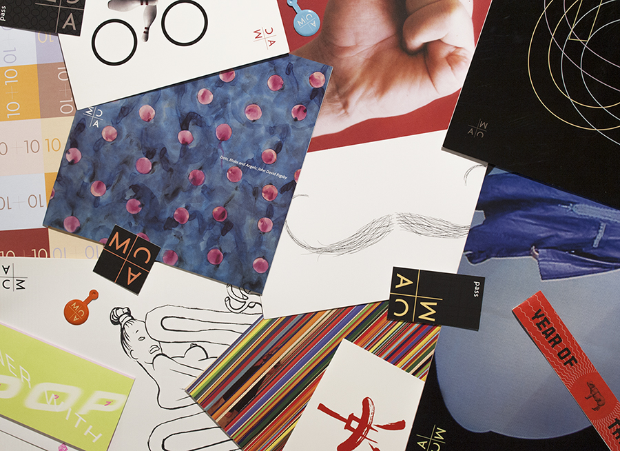
When the visionary curator, Cydney Payton, took the reins at Museum of Contemporary Art | Denver, she knew she needed to build strong branding for the institution. And she had to do it fast. We started with a simple monogram and an attitude. The logo varied (the color changed, the letters rotated) as did all the design materials, according to the look of the current show. The goal was to keep the image always fresh, always contemporary and always looking like it came from MCA | Denver.
The Museum’s Shop branding.
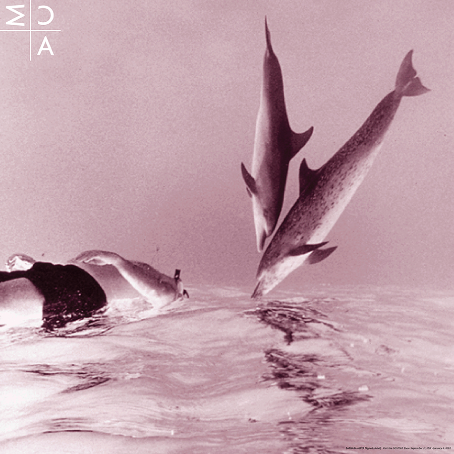
After we introduced the new branding, the first newsletter featured the “Go Fish” show, curated by the fabulous Jane Fudge. The newsletter folded out to 24 inches square with a poster on one side and text on the other.
Barbara Alper: Flipped (detail); 1997.
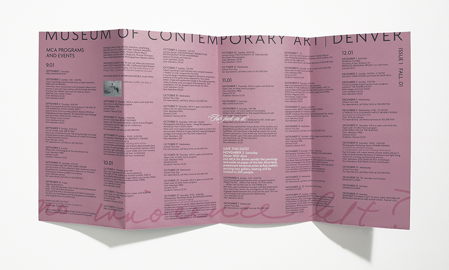
Yes, we quoted W.C. Fields who, when asked why he didn’t drink water, said, “Fish fuck in it.” A prominent local art critic noted this in print and suggested something new was happening at MCA. Mission accomplished.
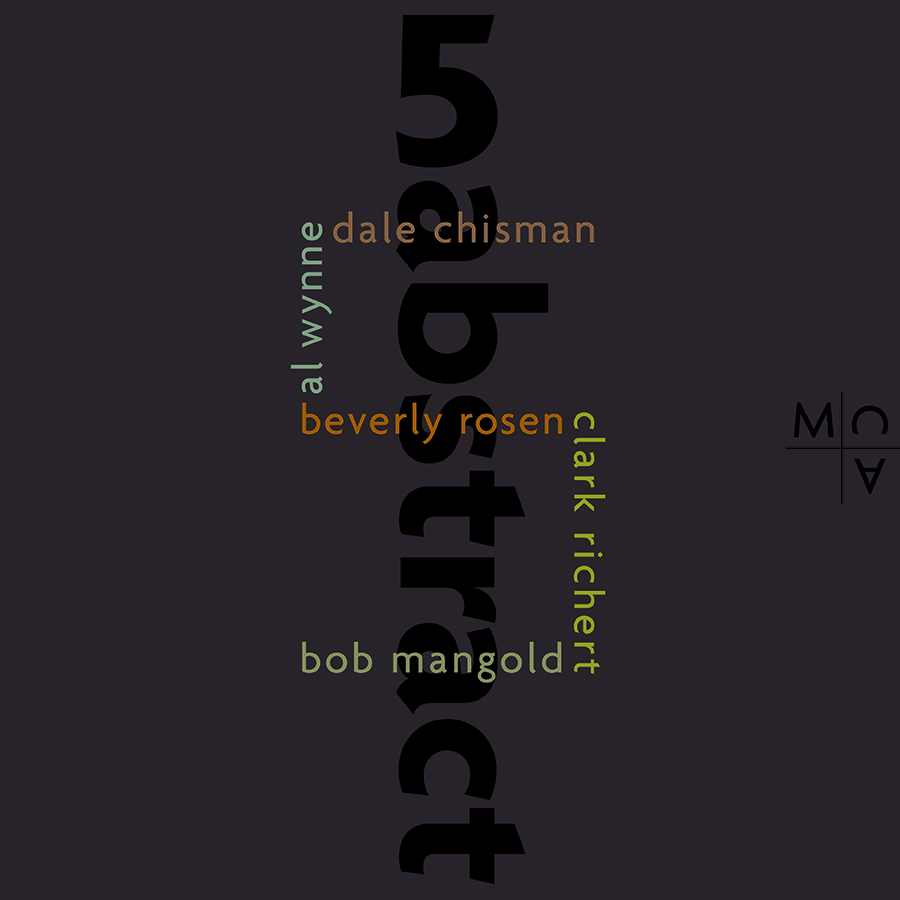
Branding for the “5 abstract” show curated by Cydney Payton.
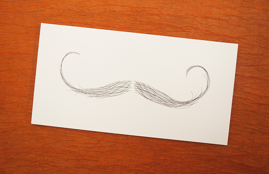
Save the date postcard for one of the Museum’s “Guess Who’s Coming to Dinner” fundraisers, The dinners were themed to a different artist each year. Guess who it was this year.
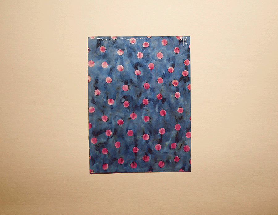
MCA newsletter, 2004.
Shown: John David Rigsby; Untitled (detail); 1979.
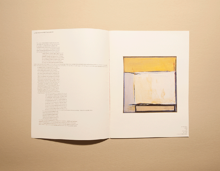
Shown: John David Rigsby; Untitled (detail); 1979.
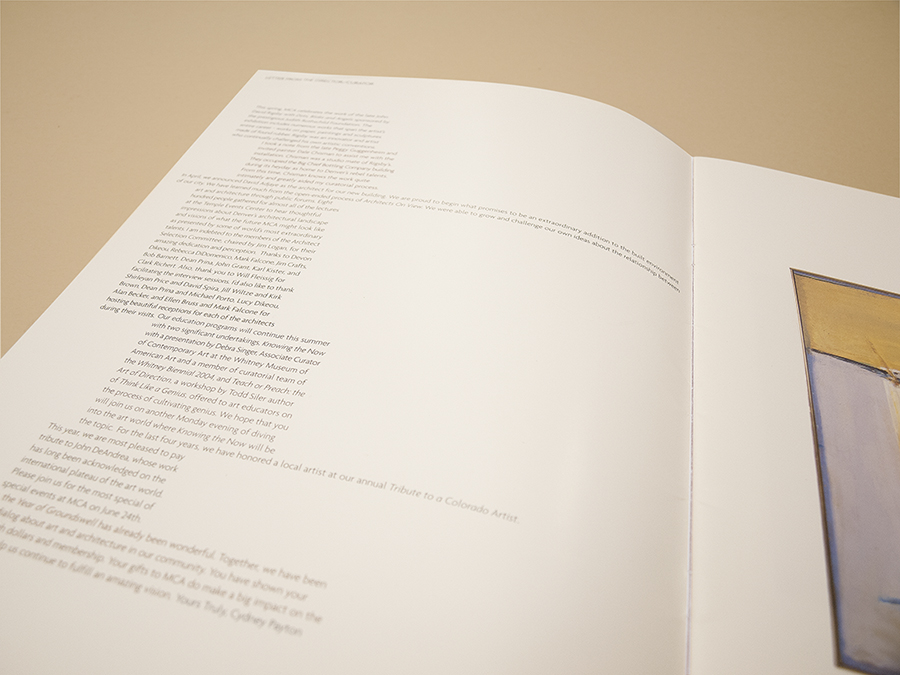
Cydney was open to ideas like “expressionistic” typography to reflect John David Rigsby’ painting.
Before the Museum built its new home, they sponsored the series, “Architects on View.” These were public job interviews as well as an introduction to the thoughts and works of six up and coming architecture firms. David Adjaye was the clear favorite and his new building opened in 2006.
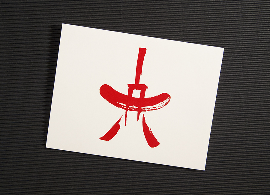
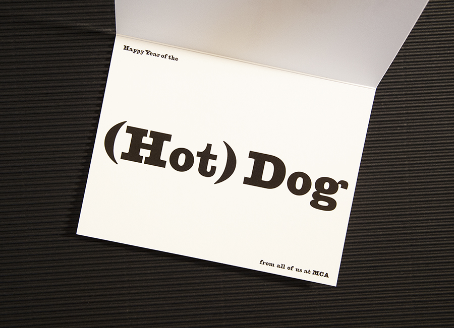
Until I worked there, I hadn’t realized that museums are in the party business. There’s some kind of fundraiser practically every week. This is the branding for one of the yearly celebrations of the Chinese New Year. It was the “Year of the (Hot) Dog.” The party was a wiener roast. The logo is derived from the Chinese symbol for fire.
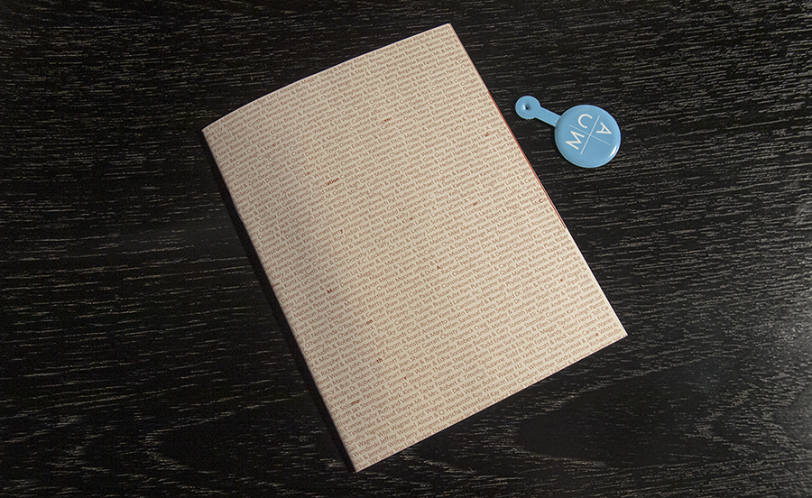
The Museum had a sensational year in 2001, putting on some groundbreaking exhibits and increasing membership by nearly 300%. For the annual report, frugality prevailed, but at 4.25 x 5.5 inches, the cover still featured the names of all the members (and a secret message or two).
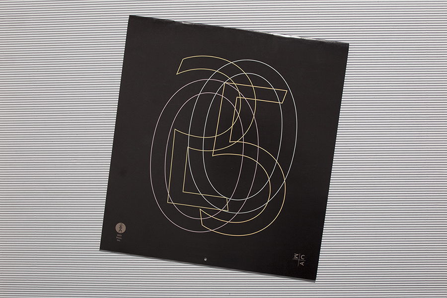
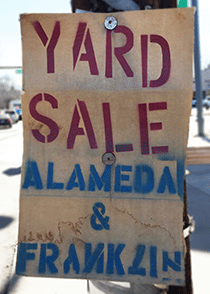
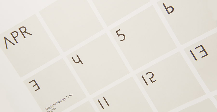
I love signs made by non-designers using stencils and marquee letters. The sign makers are not always constrained by the usual rules of lettering. If there are not enough Es a backwards 3 will do. In the fluid spirit of the MCA branding, the letters and numbers for the 2005 calendar printed by NSO Press were mixed up, rotated and flopped.
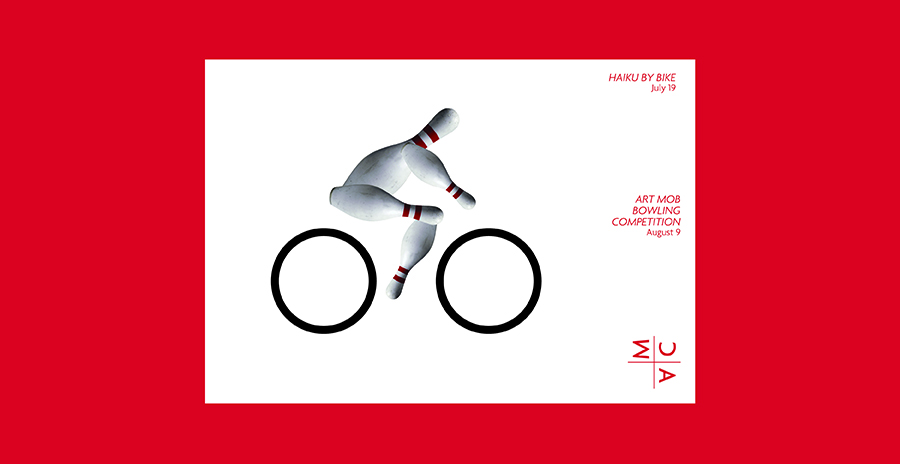
Postcard for two more fundraisers.
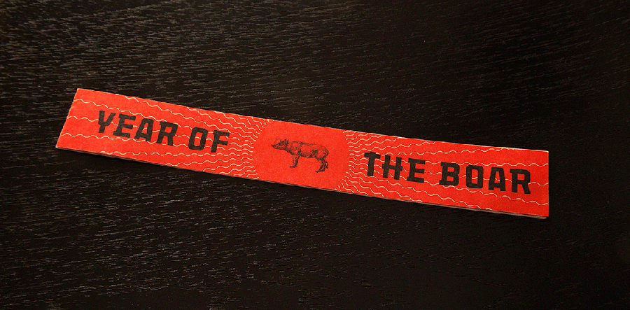
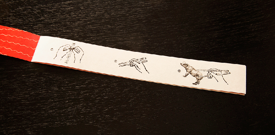
For the 2007 “Year of the Boar” fundraiser , the invitation was the size of a chopstick sleeve.
